2 Likes
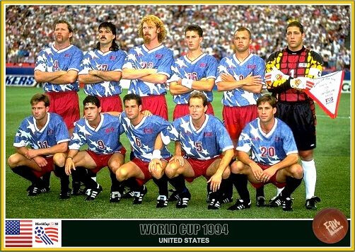
The 94 kits look like an aligator.
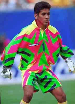
The Jorge Campos kit - wow! A bit distracting I’m sure of penalty takers haha.
1 Like
He was the guy who made me want to be a Goalkeeper. In retrospect, not actually the best keeper, but had some real excitement to the way he played…and dressed, apparently, though I don’t remember that part.
2 Likes
Jorge Campos is an inspiration to us short goalkeepers haha
3 Likes
So, tomorrow is the big reveal. Are folks in Spain making fun of the fact that our kits are made and sponsored by a company whose name is effectively “beaver”? If not, surely we only have a couple days left before they will.
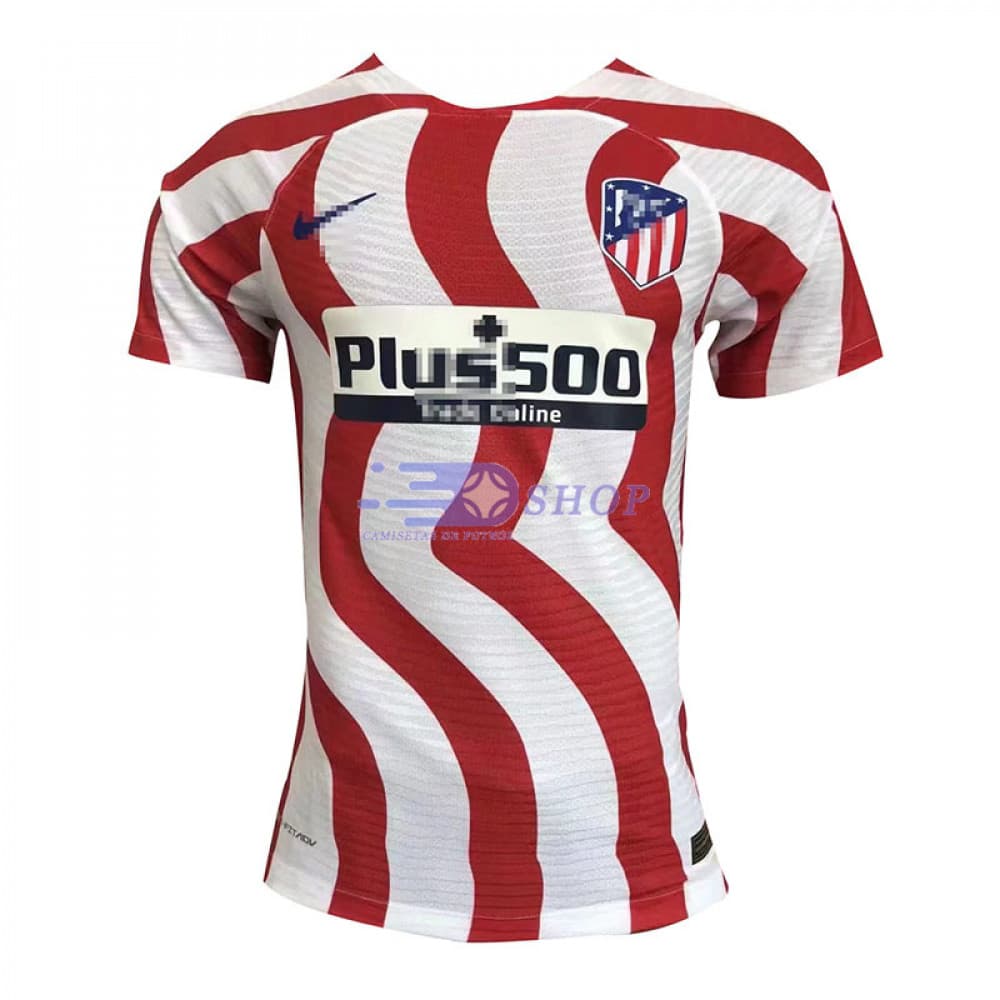
Also, did you guys see the Patético kits? …with the windings stripes to mimic the winding bends of the Manzanares rivers? Are they screwing with their fans? Or as the Brits in this group might say, taking the piss?
BTW, if your company is named beaver, how do you pick wings for your logo? Or is it a reference to the famous Welsh saying “when beavers ![]() grow wings
grow wings ![]() ?”
?”
1 Like
It’s made to confuse the opponent players. They will probably think the those strips are moving or something… optical illusion.
2 Likes
New main kit sponsor for this season: DEGIRO
Another financial services company like NAGA.
2 Likes
Reminded me too much of the Spanish word NALGA, but at least wasn’t ugly. I hope the logo isn’t ugly, I don’t care much what it’s for, as long as it’s not covered in oodles of Mandarin or some such.
1 Like
Here they are:
https://www.marca.com/futbol/sevilla/2022/07/01/62beac06e2704e64b68b4577.html
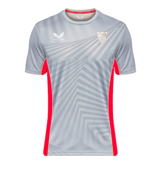
No word on third kit, but hopefully soon. First impressions are positive on my end. I think the Alcazar texture on the white gives it enough of a touch that it’s not as painfully boring as we feared from the leaks.
Also happy to report that the sponsor logo looks perfectly dull, nothing to distract from the real star of the show, mi Sevilla Fútbol Club!
9 Likes
Agreed, the patterns are nice, the short line to divide the sleeve isn’t bad either.
Good start of the off season ![]()
3 Likes
I like the graphic on the home kit, but I don’t like that they’ve left the sleeves plain white, I’d rather see an all-over print on an otherwise plain kit.
They’ve said the away kit is supposed to reflect the RSP lit up at night, but I’m not sure I like it.
The Sevilla Atletico kits look odd, particularly the home kit. The use of bands on the shoulders and the gap at the top of the shoulder where the sash ends, just looks like really lazy design work, especially when they talk about this being a chance to get bespoke kits. I know it’s the youth teams, but still…
3 Likes
I agree with all of this!
1 Like
I agree with the ones that actually like the first kit, but are more ‘meh…’ to the away kit. I’m not sure what it is, but I kinda get a Granada-feeling with those horizontal fades. I like the idea of the Sevilla-by-night, but it doesn’t quite work imo.
The details on the first kit are beautiful though.
2 Likes
Seems like a miss not to use the same patterns that is on the first kit instead of the racing flag.
1 Like
That’s unfortunate. I’m a huge fan of black goalkeeper kits, not as much yellow
1 Like
Are these official? Because if you look closely, they’re just renders. The two images are identical, just different colors photoshopped onto the image. Seems like they could have gone to the trouble to at least take a picture of the actual kits.
Anyhow, even as a former keeper (and an occasional wearer if long sleeve t-shirts), I never waste my money on keeper kits.
2 Likes
So, I didn’t like it a whole lot at first, but the red kit is growing on me after seeing it in the last few matches.
4 Likes