My first kit was a Joma and it basically peeled off to nothing. I ended up tossing it.
2 Likes
I love my JOMA. Still kicking, but only worn maybe 25-30 times
1 Like
This is what I saw.
2 Likes
A post was merged into an existing topic: Monchi requesting out?
I love it! It’s very retro which is cool!
1 Like
I really liked the multiple thin red bands on the sleeves end and collar from the one I saw. And the Castore Logo, looks great too. I might get that one, if it turns out to be the official one.
1 Like
So a rumor that the main kit sponsor is no more.
1 Like
That’s unfortunate. That’s a big loss of revenue.
1 Like
No more, as in “out of business” or just “pulling out of their relationship with SFC”?
2 Likes
Kit is announced, and it looks like the one you saw in the rumors:
2 Likes
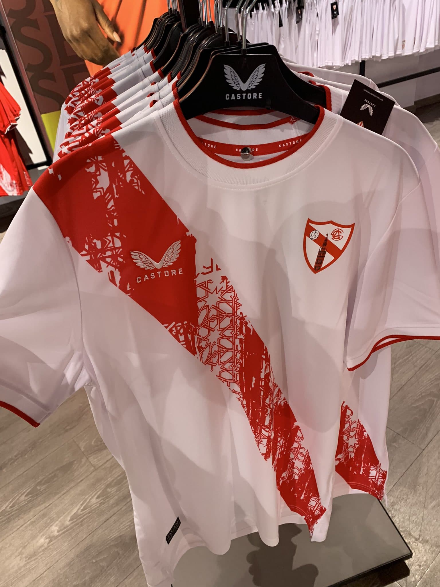
From what I can see, I love all three kits this year.
Does that home kit have a collar or just a false collar?
Never been a fan of kits with a collar
4 Likes
Analysing another aspect of the kit reveal, I see there are First team players in the video reveal:
Ocampos, Gudelj, and Fernando. My guess is that means we are thinking it’s unlikely we’ll see Ocampos or Fernando, but does anyone know if there’s ever been precedent of us selling a player who is a main kit “model” for the season? I can’t remember that ever happening.
2 Likes
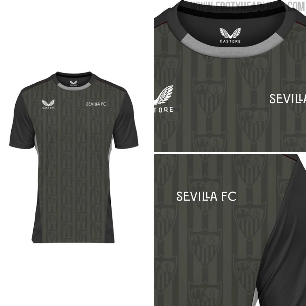
Training kit also revealed. Looks putrid from first glance. Front looks like a high school Photoshop project.
And on closer inspection, the third kit has a bit too much blue for my taste, but it might grow on me. The actual design is fine for me, I just don’t know how much I like it having that much bright blue on it.
Overall, Castore still seems to be hitting the mark. Or hitting the Marks. @Mark_EG and @Mark_L, ![]()
2 Likes
I’m really curious what the really light printing on the white shirt is.
My only concerns is I wish there was more of a design on the white one as well as the fact that the red one doesn’t have a look unique to the city/team.
The third shirt has shapes of Spanish tile work similar to the tile work on the previous year’s white shirt, but the blue is a little too much.
That being said, overall I do like the first two kits
1 Like
But wait, THERE’S MORE!
The training kit is paired with…wait for it…
PURPLE SHORTS!
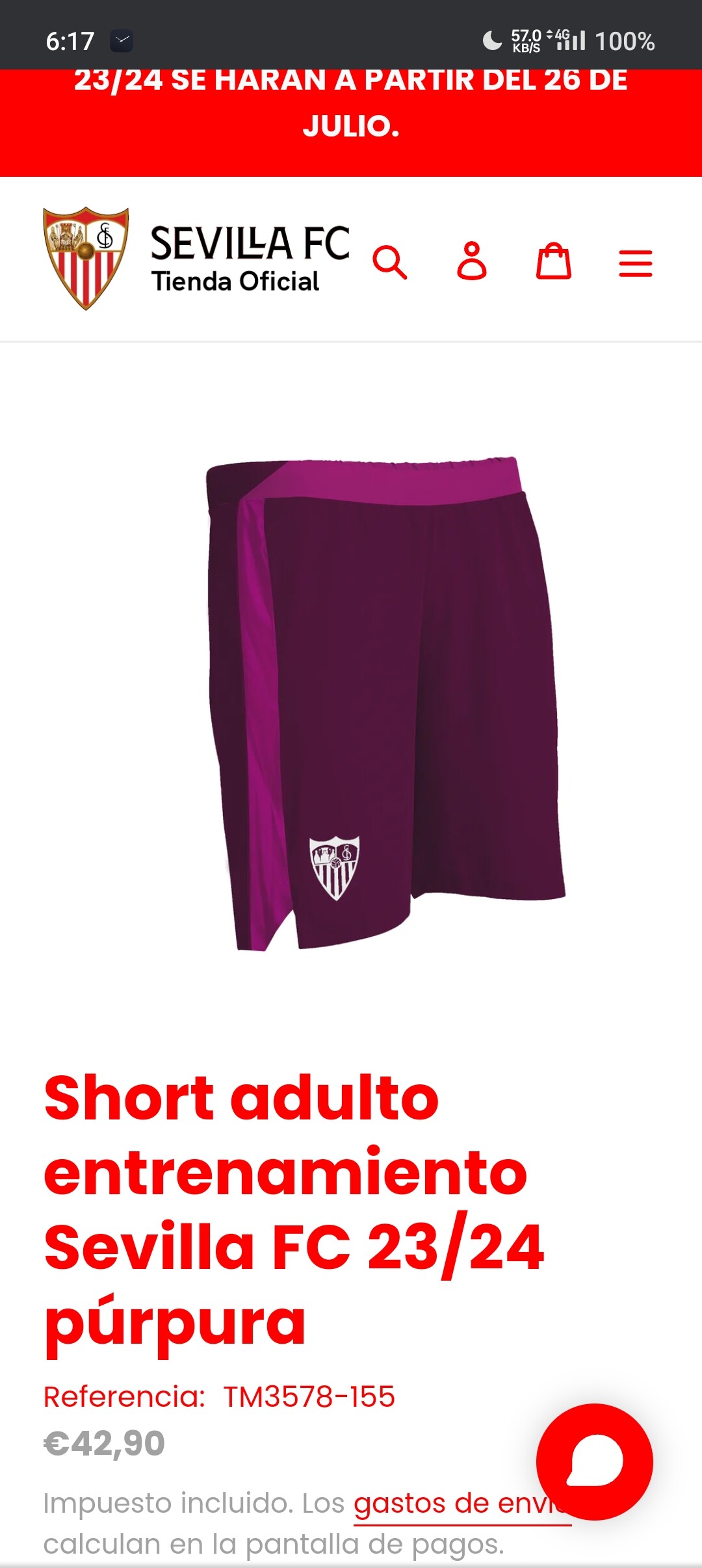
Ugh, I guess they learned their lesson from years when the training kit was so nice that no one bought the real kit but you can guarantee I won’t be buying the training kit this year.
2 Likes
Really nice update from Castore, I like the simplicity of these a lot. The all-over pattern of the home kit seems more muted than last season though, which was barely visible on-camera to begin with. I’m sure it’s nice in-person. One small detail is the change from a black Castore logo to a red one, helps a lot. Going to take a while to get used to the new La Liga logo though.
2 Likes
I really like the kits in general… hopefully it’s a sign for a successful season ahead ![]()
4 Likes
All of these game kits are fire! Let’s go!!!
But I have to agree on those socks, those are ugly.
4 Likes
Am I the only one who likes the socks? They give a nice retro feel
3 Likes