@TimSpence2 Bilbao changed their name to Atletico Bilbao in 1941 after Franco’s decree banning foreign names. They reverted to Athletic in 1972 following the end of the Franco regime and in 1976 the basque derby marks the first time the basque flag was shown in public following Franco’s death, when it was carried out and laid in the centre circle by the two club captains.
5 Likes
Interesting, so that’s how they got round Franco’s ban, by half changing their name … that was clever or dangerously stupid.
1 Like
I was in Terifa once and a restaurant by the ocean had a Athletic Bilbao logo as part of the business logo. I tried to ask what that was all about, but my Spanish wasn’t good enough to figure out the response. haha
1 Like
Now that’s a proper third kit!
5 Likes
I was happy when the news broke about Nike being our shirt supplier. But we get keep getting treated like a C-Tier team despite our successes on European level, it’s such a shame.
2 Likes
Black one looks beautiful. Even better no sponsor, you got it before the Naga deal?
1 Like
Beautiful, I like the collar as well 
1 Like
Why is every kit other than the official ones better? 
3 Likes
So good looking!
1 Like
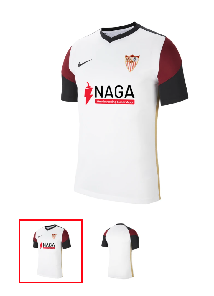
Is it just me or does the sponser + logo look poorly photoshopped on the kit?
As much as I hate the kits Nike give us, they have given us some marvellous training wear over the past 4 years.
Agreed. The only Sevilla gear I’ve bought since Nike are trainingwear and polo’s hahaha.
3 Likes
Profile picture looking slick
all the edits: how do I make sure this is a reaction to Surrey? I’m confused
1 Like
Alternatively, you can click and highlight the text you wish to reply to and click the “Quote” button that pops up.
2 Likes
Do you know someone I’m Sevilla who can buy them for you in person and ship them?
1 Like
You choose, your style. If I’d get one it would be Erik Lamela, maybe obvious. The flair and style plus the type of player I like. I liked him when he came to us, but the way hes exceeding all expectations only adds to hype.
2 Likes
I like the red socks better than the black ones to be honest.
3 Likes
I hate white socks.
Idk, i feel black socks gives us a bit of an edge. Reminds me of big teams like Man Utd & Rangers (relatively speaking), who looked threatening in their day.
1 Like
Still, I prefer the red over white on socks, cause it shows the teams colours. 
I would hate the opposite though – Red / Red / White would be disgusting. That’s why i hate Chelsea’s kit so much. 
2 Likes